
Our client Monday.com offers a computer program to coordinate and manage small to large teams. After various major international cities, such as New York and San Francisco, had already been covered with large-scale out-of-home advertising, the Monday customer base in Berlin was now to be increased through a short but concise campaign, with outdoor advertising.
The target group was clear: mid-level managers who coordinate several employees. In previous campaigns, Monday.com had used transit advertising and billboards in the train station area, and as many of them as possible together to create dominance and stand out. But how do you meet mid-level managers in times of pandemic and home office? Are the Berliners still in home office or has mobility picked up again? Is it already worth it to place out-of-home advertising again?
To get an impression of their target group’s mobility behavior Monday.com conducted an internal study with Berliners already using their team management tool. The study was conducted in March to get a timely impression and meaningful results for the campaign planned for May. The results showed a busy pattern of movement and use of public transport and private cars to get to work. Some users alternated between home and office work, but Berliners were on the move a lot, again. Monday.com drew the following conclusion:
Yes, running out-of-home advertising is worth it now!
Transport advertising, interior advertising & posters on the streets reach Berliners
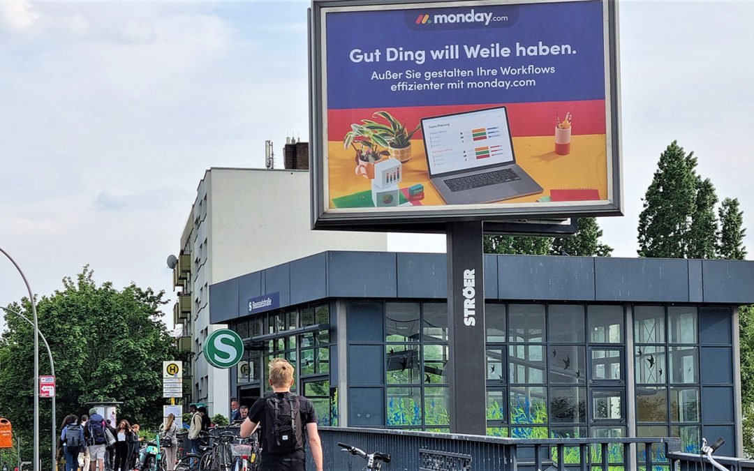
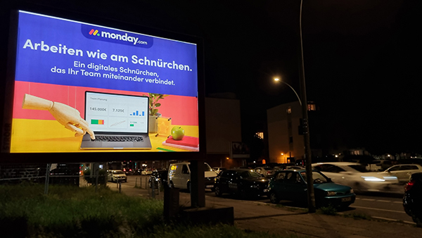
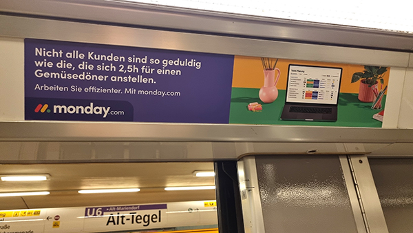
The survey not only determined whether out-of-home advertising was worthwhile again at this time, but also where the clients are located and with which means of transport (and which line!) the customers come to work. The majority use the subway (U-Bahn), urban rail (S-Bahn), and the car. So Monday.com decided to use transport advertising, more precisely interior advertising, as well as posters in City Lights on the street to reach the Berliners. To generate strong visibility and reach in the campaign period of 4 weeks, 2560 side strips in the U-Bahn (25.6% share), 1150 ceiling posters in the S-Bahn (10.3% share), and 56 City Light boards were placed on the streets in the core area (Mitte, Friedrichshain, Prenzlauer Berg, Kreuzberg).
 This combination of transit advertising and billboard advertising has proven to be successful in out-of-home advertising, as it addresses all mobile people on the street, regardless of whether they are traveling by public transport, bicycle, car or on foot. In particular, the high number of foils used as interior advertising in the S-Bahn and U-Bahn trains created a strong presence that increased awareness and brand recognition. As a result, there was probably hardly a mobile Berliner in May who did not come into contact with the advertising on an almost daily basis.
 Different motifs – 1 look-and-feel
 Different motifs – 1 look-and-feel
Especially when you place such a large number of foils as transport advertising, it makes sense to place different motifs to appeal to even more people. But with several motifs, there is always the risk that the onlooker no longer associates the motifs all with the same company. Therefore, there must be a uniform look-and-feel, which makes it clear to the viewer that all motifs are from the same advertiser. This can be achieved through various design factors, such as colors, poster composition, typeface size and type, figures, and focus products.
 Monday.com decided to place 5 motifs on the City Light Boards, and 8 motifs each in U-Bahn and S-Bahn. Although so many motifs were used, one could clearly see a common look-and-feel, both in the structure, the color scheme, and the focus product. On the right side of the interior ads, there was always a table with a laptop, the desktop of which showed the Monday.com program. The left half of the motifs was always adorned with a pun or an allusion to Berlin-specific cultural assets. For example, like this allusion to Berlin sports clubs: „Die Alte Dame, die Eisernen oder die Füchse. Ihr Team ist das Wichtigste! Bessere Workflows. Stärkere Teams. Mit Monday.com.“ (Reference to Hertha BSC, Eisern Union and die Füchse.) On the bottom left of each motif was the Monday.com logo.
Monday.com’s Berlin campaign is a very good example of a campaign with multiple motifs that manages to keep a clear look-and-feel, and thus, does not bore the customer, even with many slides next to each other, but on the contrary, encourages them to keep reading the puns. Well done!